比如我们需要实现段落中重点文字的标注,可以使用到警告框(Alert),然后前面再加上Glyphicons字符图标就更加完美,比我们用CSS样式自己定义简单很多。
第一、简单的警告框(Alert)应用
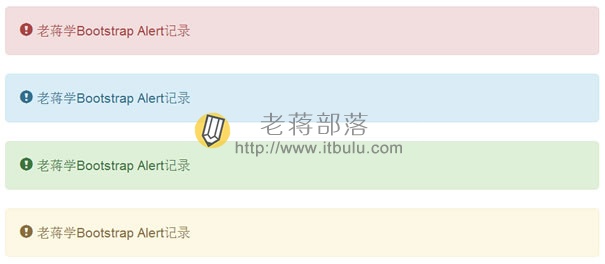
简单的内置四种色调。
> <div class="alert alert-danger" role="alert">
> <span class="glyphicon glyphicon-exclamation-sign" aria-hidden="true"></span>
> 老蒋学Bootstrap Alert记录
> </div>
> <div class="alert alert-info" role="alert">
> <span class="glyphicon glyphicon-exclamation-sign" aria-hidden="true"></span>
> 老蒋学Bootstrap Alert记录
> </div>
> <div class="alert alert-success" role="alert">
> <span class="glyphicon glyphicon-exclamation-sign" aria-hidden="true"></span>
> 老蒋学Bootstrap Alert记录
> </div>
> <div class="alert alert-warning" role="alert">
> <span class="glyphicon glyphicon-exclamation-sign" aria-hidden="true"></span>
> 老蒋学Bootstrap Alert记录
> </div>
可以根据需要使用到合适的位置。
第二、有关闭按钮的警告提示
照理警告框是用在有警告提示的时候的,且有关闭按钮的。这里我们可以加上关闭按钮。
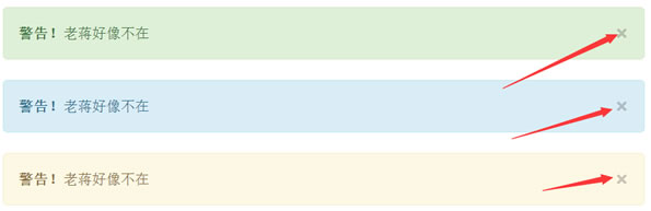
可以看到多了一个关闭按钮且可以关闭警告提示。
> <div id="myAlert" class="alert alert-success">
> <a href="#" class="close" data-dismiss="alert">×</a>
> <strong>警告!</strong>老蒋好像不在
> </div>
> <div id="myAlert" class="alert alert-info">
> <a href="#" class="close" data-dismiss="alert">×</a>
> <strong>警告!</strong>老蒋好像不在
> </div>
> <div id="myAlert" class="alert alert-warning">
> <a href="#" class="close" data-dismiss="alert">×</a>
> <strong>警告!</strong>老蒋好像不在
> </div>
> <script>
> $(function(){
> $(".close").click(function(){
> $("#myAlert").alert();
> });
> });
> </script>
记录一下,以后用到可以方便找到。